Case study
Shree Rang Cashew
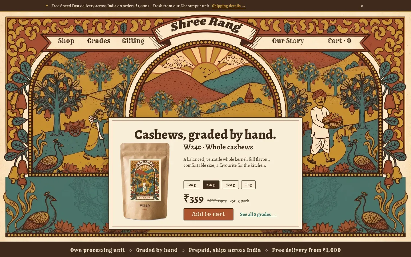
Shree Rang Cashew sells graded cashews online. I designed and built the site: a vintage-label brand look, a shop with product pages, a guide that explains what the W-grades mean, and a journal, all built phone-first.
§ 1At a glance
- Client
- Shree Rang Cashew
- Type
- Brand and e-commerce website
- My part
- Design, build and content structure
- Build
- Static, Astro-style build on Cloudflare
- Size
- About 40 pages
- Live site
- shreerangcashew.in (opens in a new tab)
§ 2What was built
What was built.
- Home page, shop and individual product pages
- A cashew grade guide that explains the W-grades
- An FAQ and a bulk-orders page
- A journal with 15 fact-checked articles written for search
- One mobile-first design system shared by every page
§ 3Pages
Four pages, one system.
Each page type, on desktop and on a phone. Same type, spacing and illustration language throughout.
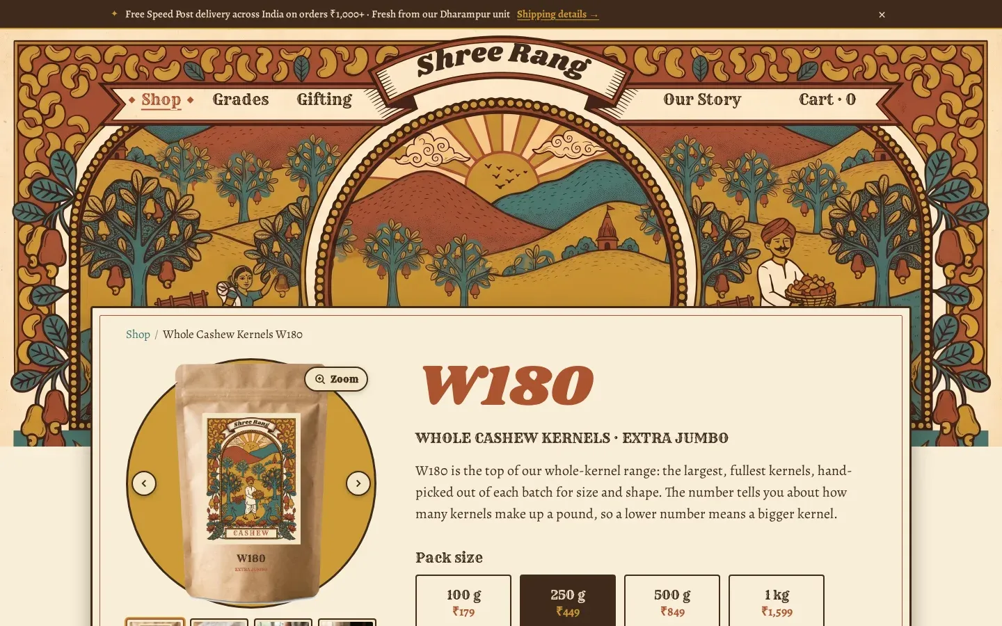
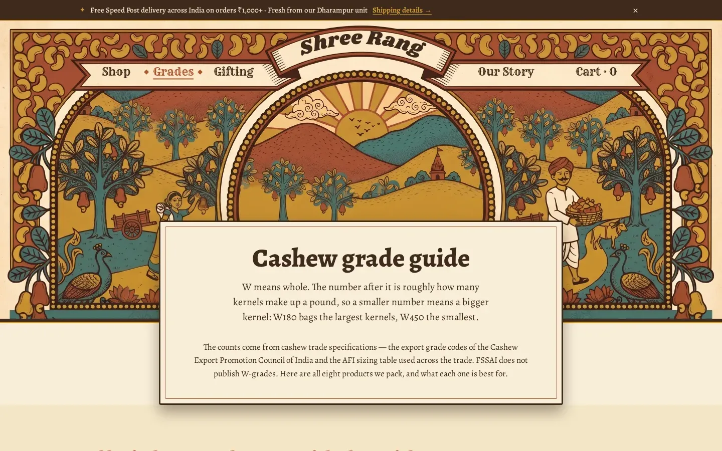
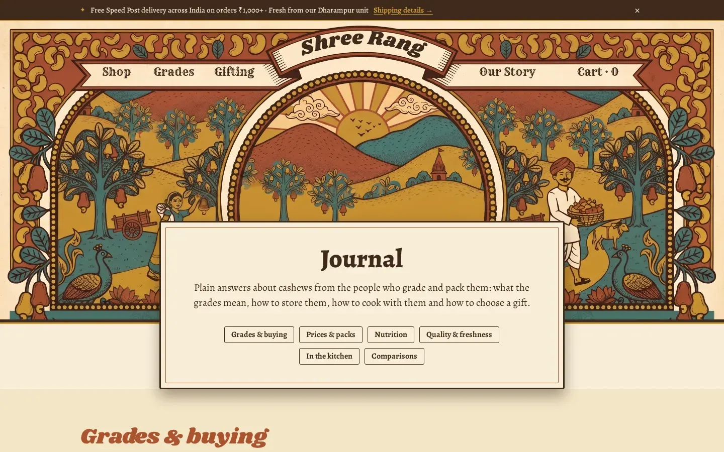
fig. 5The same four pages at 390 px wide. Mobile came first.
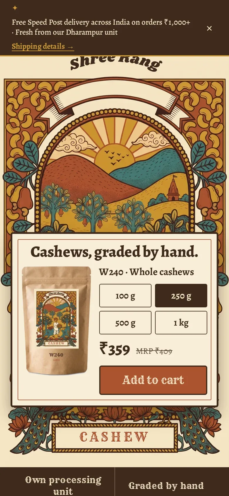
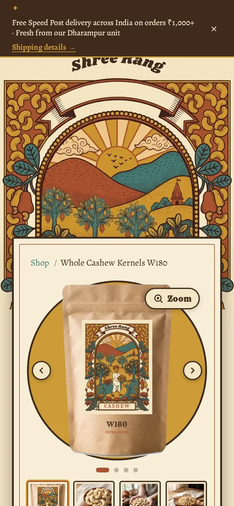
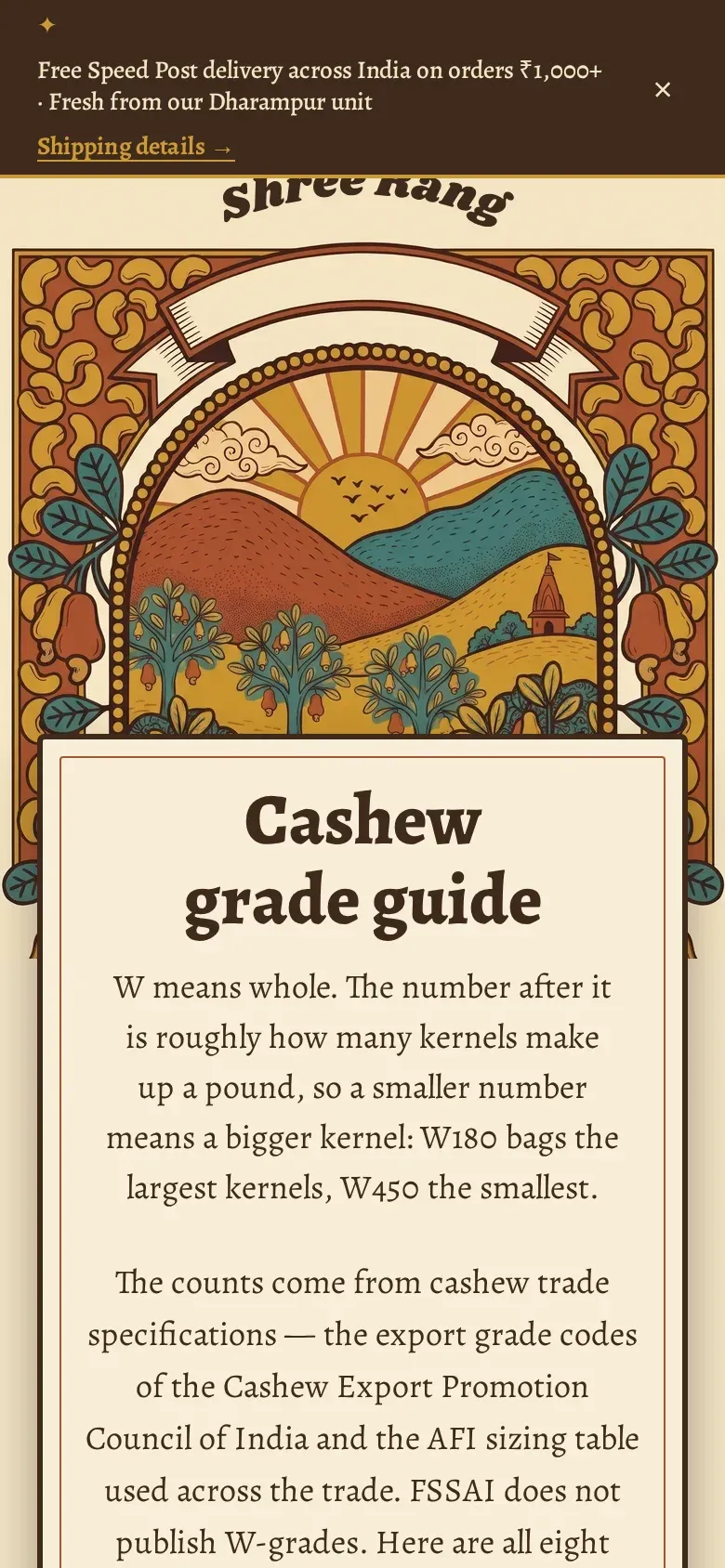
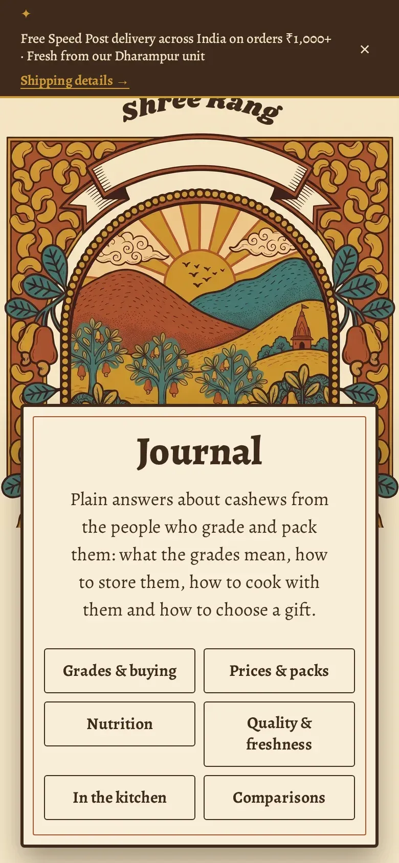
§ 4Design
The look.
- A vintage-label visual identity: an illustrated arch, hills, trees and a banner wordmark, in a warm earthy palette
- Headings and body set in serif faces that match the printed-label feel
- The same components and spacing across shop, guide, FAQ and journal, so the site reads as one object
- Designed for phones first, then widened for desktop
§ 5What I did
My part.
- Website development
- UI/UX design
- Content and SEO structure
No traffic, sales, revenue or ranking figures are shown, because none have been verified for this page. The screenshots are of the live site as it appeared on 5 November 2026.
fig. endNext step
Want something like this for your business?
Tell me what you sell and who buys it. I will reply with honest next steps.
- Phone
- +91 87338 44336
- [email protected]
- Hours
- Monday to Friday, 10:00 to 19:00 IST
- Reply
- Within one working day